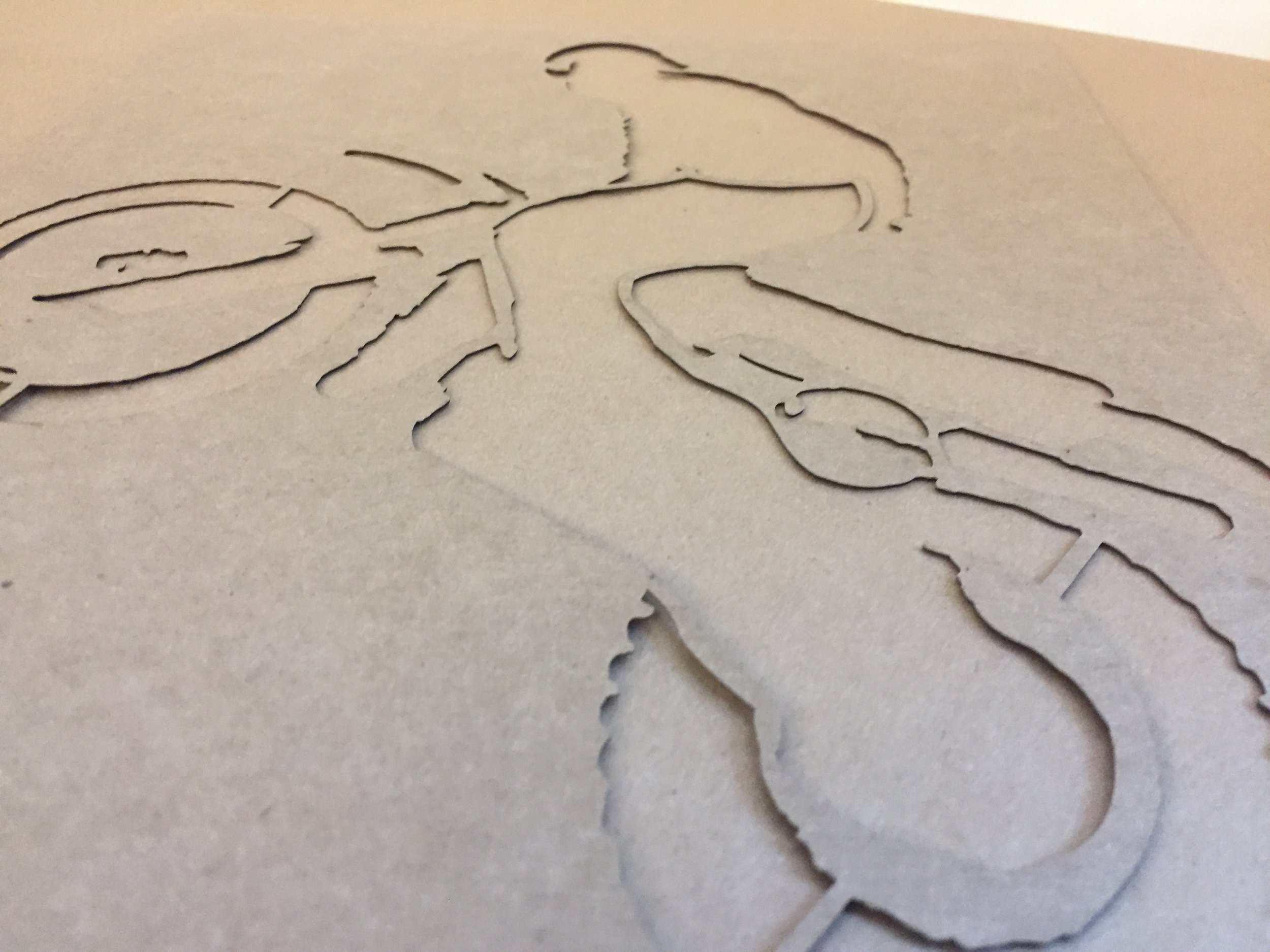
Surprisingly often, designers don’t consider the connections that are needed to keep the pieces of their laser cut art together. For discussion purposes, consider paper elements of a design as positive and holes as negative. All positive elements must connect to each other in some way or they’ll fall out. The larger the positive piece, the more connections it will need.
For example, if the positive center of a negative circle is stenciled at the top and bottom only, it may “spin” on those connections. Adding an additional stencil would make it more stable. Of course the number of stencils and their thickness depends on the stock’s weight, the product’s intended use and other aesthetic considerations. For small elements, you can often get away with very few light connections, but the width of any connecting stencil should be no smaller than the thickness of the stock.
It’s important not to think of these stencils as a particularly bad thing. They don’t have to look ugly or detract from the design if they’re considered early in the design process. Ideally, they can become an organic part of the art and contribute to it visually as well as structurally. Also, shifting selected parts of the design from positive to negative is often an effective way to give structure to the art without specifically adding elements.
When considering stencils on negative script typefaces, or other similar shapes, try to follow the rhythm of the form with the stencil strokes. This makes them visually blend into the design in a natural manner.
Laser Cut Paper will always check your art to verify that connections which are intended tostructually hold together are in-place, unless you specifically instruct us not to. There may be additional charges for art time if these modifications are extensive but we will submit these changes for your approval before proceeding into final production.